Color theory is a series of rules and guidelines that designers use to communicate through color schemes applied to visual interfaces. The science is centered around how color impacts the human mind and psychology – in other words, how a particular color, or juxtaposition of colors, affects our moods.
Color theory is a series of rules and guidelines that designers use to communicate through color schemes applied to visual interfaces. The science is centered around how color impacts the human mind and psychology – in other words, how a particular color, or juxtaposition of colors, affects our moods.
At the most basic level, color is the aspect of any object that can be described in terms of hue, lightness and saturation. Color value and intensity will change based upon how an object absorbs or reflects light. Just think about how the hues of a lawn change during the day as the sun shifts while different light frequencies hit the grass. The grass didn’t change its color. Rather, the light changed the way the color is interrupted by the human eye.

Color Matters
A number of design elements contribute to the creation of welcoming and productive work and learning environments. While furniture selection and space planning certainly play a significant role, color should always be a key consideration when designing public areas.
Notably, numerous studies have shown that color can impact learning and memory – both of which are fundamental to the success of employees and students. In fact, research has found that monotone classrooms can invoke feelings of anxiety, distress and fear along with a sense of agitation and difficulty in concentrating.
Strategically Weaving Color Into Interiors
There are many easy ways to incorporate color into public spaces. For example, adding plants is not only a cost-effective method of adding green accents in an office, classroom or waiting area, but also provides wellness benefits by helping to purify the air.
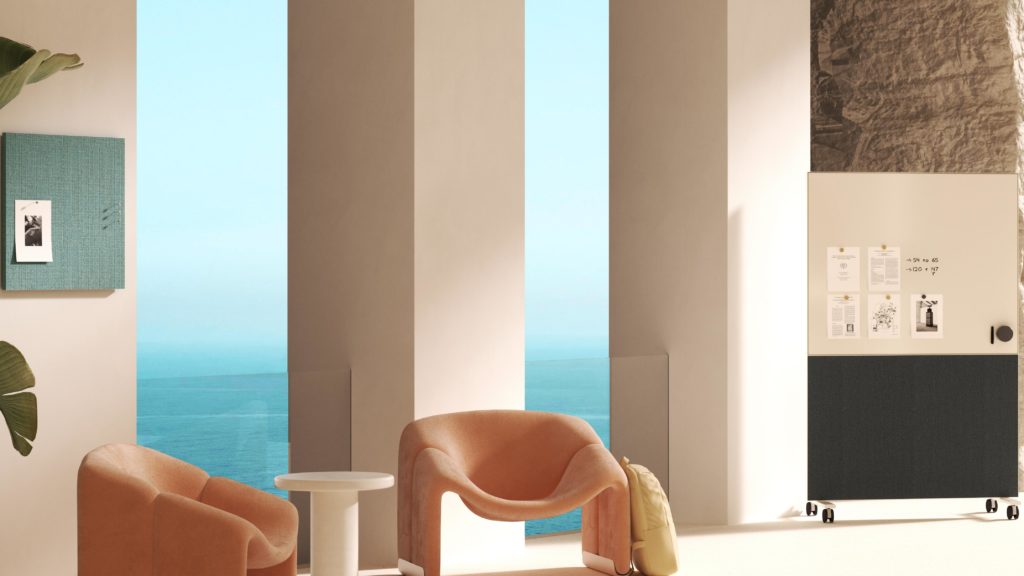
Similarly, incorporating colorful writing surfaces and dividers delivers performance and functionality while also imparting personality and style. Products such as Textura Mobile, which serves as both a writing surface and small portable wall, can improve collaboration while helping to diffusing sound.
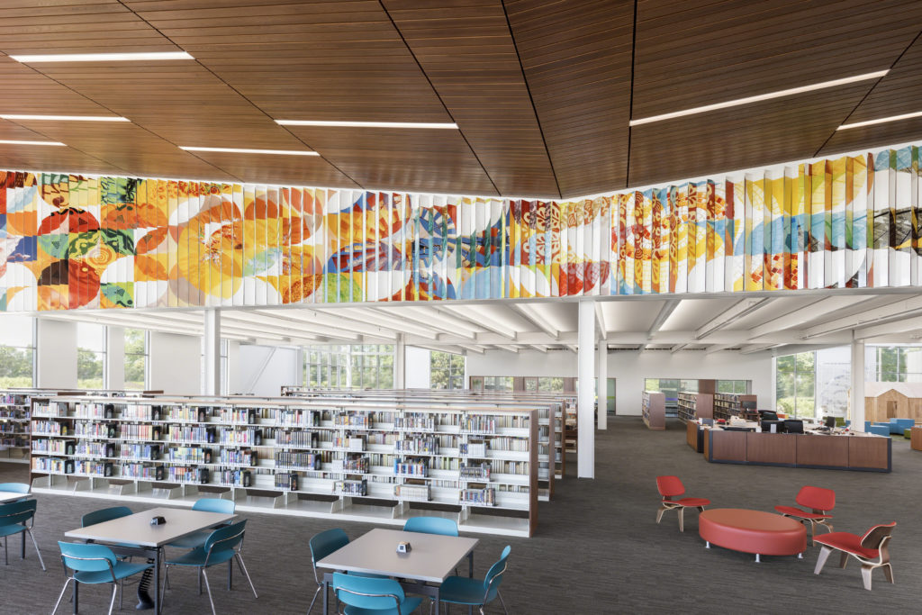
Adding color to spaces via high definition art produced on a durable, hygienic material such as CeramicSteel can bring spaces to life in unexpected ways – and even provide health benefits. For example, patients in healthcare settings who are exposed to art show observable signs of improvement, including the need for less pain medication, reduced stress, lower blood pressure and heart rate, shorter hospital stays, and better overall satisfaction with healthcare services.
Weave | 24” x 24” Sligo
Whisper | Paseo
The Impact of Color on People
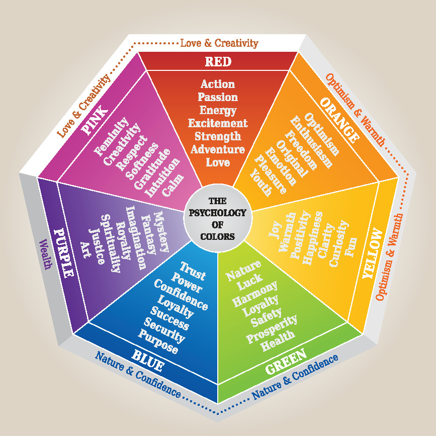
So how do certain colors affect mood? Following are some common attributes associated with popular colors.
Blue represents calmness and serenity, such as the feeling of gazing at the ocean or a cloudless sky. It also inspires a sense of inner reflection and can invoke imagination while boosting productivity. In fact, research has shown that people are more productive in blue rooms, which is why blue is commonly seen in office settings.
Green is symbolic of nature and reminds us that we are connected to the natural world. Green can inspire feelings of growth, vitality and productivity – and may also improve memory and reduce fatigue. Because it can put people at ease in an unfamiliar setting, designers often use green in public spaces like restaurants and hotels.
Red is an intense color often associated with strength, power, energy and passion and is known to invigorate and enliven. Because red attracts the eye and can alert to potential danger, it is a good choice for important signage. Red is also known to encourage creativity and to increase appetite, which is why red is such a popular color in restaurants.
Yellow has been linked with enhanced mental activity, elevated awareness and increased energy. It is also believed that yellow can inspire positive feelings and happiness. However, because yellow can create eye fatigue due to the high amount of light that is reflected, it is typically used more sparingly in public environments.
Orange is commonly described as bright and joyful. Many people associate the color with experiences such as watching a beautiful sunset or the fresh taste of citrus. While orange is typically perceived as playful and inviting, it can overstimulate the senses, making it more difficult to engage in tasks requiring concentration such as studying.
Brown signifies stability, strength, dependability and wisdom. Additionally, brown may reduce fatigue and encourage relaxation. Because brown is often seen as solid and “down to earth,” it is often associated with nurturing along with a sense of resilience, security and groundedness.
Color in public spaces can be an integral factor in how we perceive our surroundings, and can alter our responses in those settings. When applied skillfully, color has the power to positively influence mood and behavior, leading to better outcomes and enhanced user experiences.